
Cracker Barrel Unveils New Logo and Campaign
“If it’s not broken, break it.” This might sound like a motto for a certain restaurant chain, and indeed, Cracker Barrel recently announced a significant shift in its branding. On August 18, they rolled out a new logo and a creative campaign that aims to “Refresh Look and Feel” while promoting “Iconic American Brands for the Future.”
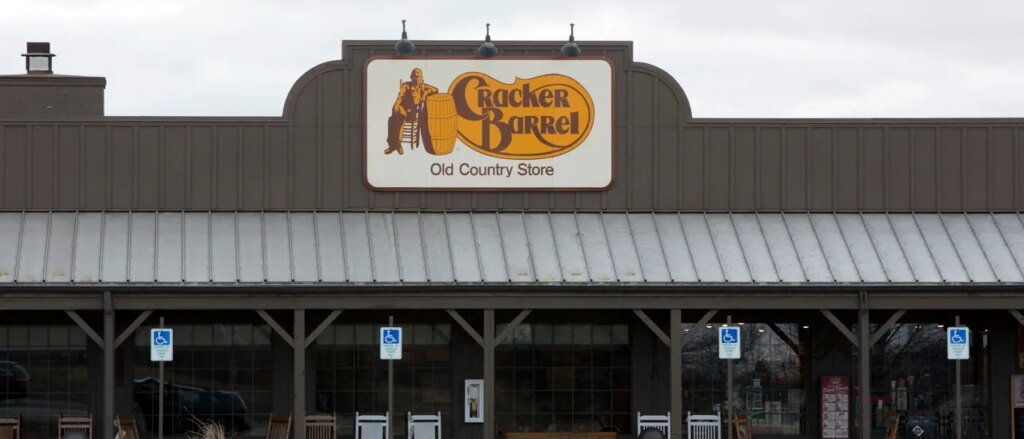
If this is what the future looks like, then it’s quite, well… boring? The new logo features a figure lounging in a chair, but the classic barrel and the crackers are nowhere to be found.
The revised logo resembles a “cracker barrel” subtly contained within a six-sided shape, devoid of any illustrations. The font has undergone a slight refinement.
New: Cracker Barrel reveals new logo, CEO Julie Fels Masino says people love their new brand.
“To be honest, the feedback was overwhelmingly positive that people like what we’re doing,” Masino told GMA, discussing the overall brand.
This logo is depressing. pic.twitter.com/ezvpwlv4bg
– Collin Rugg (@CollinRugg) August 20, 2025
The brand claims the new color palette is inspired by “farm-fresh scrambled eggs and buttermilk biscuits.” But seriously, what were they thinking over there?
Logos should say something meaningful about a brand. The old Cracker Barrel logo conveyed a sense of “affordable and country-western.” Their new one? It feels more like a mishmash of corporate design ideas. It certainly seems to lack the charm of the past.
This change doesn’t just stop with Cracker Barrel. It seems like logos across the board are also facing identity crises. I found out MSNBC is becoming “MS Now”—as if that’s a game changer.
Take Jaguar, for example. They ditched their iconic logo for something that feels more like a casual wordmark. What once screamed luxury and speed now resembles a font meant for a children’s language app. At least it’s a change, I guess.
Did MSNBC hire the Jaguar team for the brand? pic.twitter.com/ksrphf1oag
– Kevin Dalton (@thekevindalton) August 18, 2025
Other brands are stripping vowels from their logos altogether—like “LMND,” which, no surprise, doesn’t mean lemonade. It’s actually clothing. Who knew?
Meanwhile, LMNT is pushing their zero-calorie drink. Maybe they just want to entice consumers with a puzzle to solve, or perhaps they believe it adds some edge. Who knows?
And while we’re on the subject of clutter, it seems to be making a comeback. Remember “Cluttercore”? It’s that messy aesthetic that some younger folks favor. Looks like chaos has its fans.
In the end, Cracker Barrel’s new direction feels… well, less than extraordinary. Not every restaurant needs a corporate makeover. I do hope their new branding encourages them to strive for more.


